Serious Sale!

These two books are on SERIOUS SALE! because they are not in perfect condition. This sale applies to orders being shipped within the U.S. only.

front.jpg
cookbook front cover final web.jpg

CREATIONS—$10, including shipping. The first batch of CREATIONS had a slight binding defect that affected the last few pages. So, we printed again and sent it to a different binder, who did a perfect job. You can see pics of the binding issue on the order page, and see a preview of the gorgeous book as well. CREATIONS Order Page

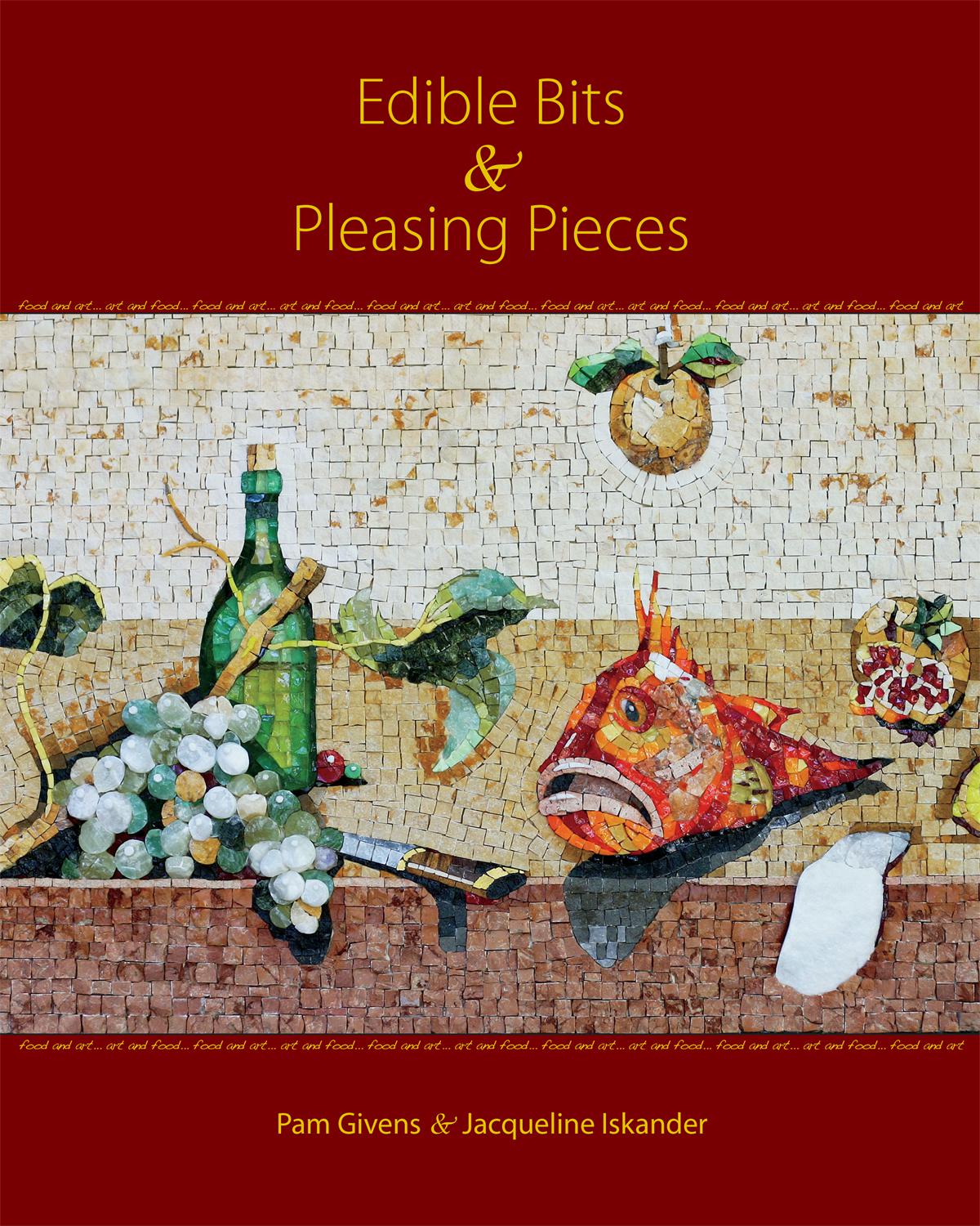
Edible Bits & Pleasing Pieces—$10, including shipping. I also have a some copies of Edible Bits & Pleasing Pieces. These were left over from a larger group that were for sale at a gallery, or are the remains of Amazon inventory. They are in fine shape except the covers show a bit of wear, and they may have an Amazon sticker or sticker residue on the back. I only have a few of these. You can also preview this book on the order page. Edible Bits & Pleasing Pieces Order Page

All Dreams, in progress

Some of the main players in my current production are ready to rumble. This palette is way more colorful than I like. I prefer a minimal palette with little contrast, or a single color family, and I did try to impose my preference on this work in the design phase. But I lost that battle and all this color prevailed.

Mosaic gold: green, turquoise, orange, blue, violet, 010/013 yellow, 015/016/017 copper

The gold pieces in this photo are all cut from 3” square plates. The smallest squares are the size of four of the smaller standard-cut gold. These larger pieces will be elevated by approximately the thickness of the gold, which runs around 1/8”. I’ve adhered a support to the back of each of these 80 pieces, painted the edges, and they are ready to go.

The design for this mosaic is foreign to me, but it was very enjoyable to work on. We sometimes call such unexpected works a departure. I’m not sure about that, but I do feel that it is a risk that I am not sure will result in success—a risk because of the expense of all the gold, and because it will be a very large and heavy monstrosity to deal with should it fail.

Still, it’s like taking a particular direction along a forked path in the woods, not knowing or caring where it leads because it just feels like the walk will be worth it.

Theme and Variations (All Dreams)

I’m almost ready to start this very large mosaic which will be titled All Dreams. It is the 5th in my Music To My Eyes series, which is inspired by classical piano music in particular forms. These mosaics rely on mosaic gold in a grid format, or opus, in expressing some aspect(s) of the form/music.

All Dreams is inspired by a contemporary classical piano piece by Christopher Theofanidis, titled All Dreams Begin With The Horizon, 3rd movement. The form is basically a Theme and Variations. Although the other pieces in the series are named by the musical form, I think that Theme and Variations is just so technical sounding, so I’m going to call it All Dreams, for now anyway. Still thinking on that…

In 2010, I created this 36” x 57” substrate (at right) from 36” square, 1/2” Wedi panels in two layers. At that time, I could not get the full 60” x 36” panels here in Tulsa, so I built one. I needed four such panels for a large commission.

As it turned out, this substrate was about the same weight as a Hardibacker panel which cost much less in both $$ and labor. The weight was a concern because I would be using a lot of stone. I went with the Hardibacker and stored this Wedi substrate away. The finished panels ended up weighing about 100 lbs. each.

A few years ago, I had a metal frame made, with an EZ-bar hanger attached on the back, and installed the substrate into the frame. This gave me a landscape-oriented substrate ready and waiting to be mosaicked.

It is pretty heavy without any mosaic on it. The Wedi substrate itself is about 30 lbs., if I remember correctly. Since framing it, I have been contemplating what I could do with this while keeping the additional weight as minimal as possible.

Over time, an idea began to percolate and I started some design work last spring. Just a bit more tweaking and I hope to start the mosaic work next week. As you can see in the photo, I have the gold all lined up, minus two orange plates that should arrive any day now. There is a 28” x 49” grid of 3/8” squares centered on the substrate. The design calls for both mosaicked and non-mosaicked areas, which I hope will help with the final weight.

It looks like I’ve got plenty to keep me busy!

A Difficult Parting

Over the years, I’ve sold a nice number of my mosaics and had a few very rewarding commissions. This degree of success is remarkable when considering the fact that I am generally terrible at promoting my work, to the point of being negligent. A generous dose of introversion augmented by some kind of insecurity inhibits my self-promotional ability.

I’ve pondered this lack of whatever-it-is for years and have sometimes concluded that I just don’t believe in myself/my work. I suppose that could be a factor. However, I really like my own creations. Sure, there have been a few flops, and those do not see the light of day under the internet spotlight. Otherwise, I make things that I enjoy and consider beautiful or meaningful—things that I want around me and that I enjoy seeing every day.

So, I believe in my work for myself, but the bridge to trying to convince anyone else that they should give my work a look—much less like it—is just a bridge too far. Sure, I’ll share new work on Facebook, and I have a website, but I can’t bring myself to actively promote my work. I’m envious of some of my fellow mosaic artists who have that whatever-it-is that keeps them sharing their work, new and old, on a regular if not daily basis. They deserve the exposure and income that result from such efforts.

Clearly, if I needed to be making a living, I would never survive by making art as I would probably crumble under the pressure of trying to promote myself. I am very fortunate to be able to explore making mosaics without the pressure of having to make money off them. Still, sharing my work and trying to sell it is important to me, if for no other reason than to pay for materials. I don’t think I’ve ever sold anything over my fine art site, but I have had some success with sales resulting from exhibitions, and I am so very grateful for that.

Storyteller (2018) 10" x 7" | 25cm x 18cm, without frame. Stones, marble, petrified shell, smalti, mosaic gold.

Finally, I get to the heart of what this post was about when I started it. Over the summer, I had a few pieces in the Traditions Kept & Broken exhibition in Bandon, OR, and I was so happy to have sold them all!

One, in particular, would never have been for sale except for the fact that I knew the person who wanted to purchase it. I don’t think I could have sold that piece to anyone else and it was a difficult parting for me.

Storyteller, at right, is that mosaic. You can read more about this piece here, which explains my difficulty in parting with it.

I find it such an honor when someone likes my work enough to want to have it in their home and spend their money on it, and I am very humbled by it.

Still, don’t you find that some works are difficult to part with?

Sold x 2

A retired geologist has purchased this pair of mosaics from my In the Woods series after seeing them in the 5th Annual Mosaic Show in Bandon, OR. I hope they bring her pleasure for many, many years!

Meandering (2014) 12" x 12" | 30 cm x 30 cm. Stone, porcelain, glass, mosaic gold.

Trespassing (2014) 12" x 12" | 30 cm x 30 cm. Stone, porcelain, glass, mosaic gold.

Bottle Finished!

Previous posts: Bottle Break, Bottle Update

Marble and Gold Bottle 18.5” x 6” | 47cm x 15cm. Marble, acid green mosaic gold.

I don’t usually give my bottles anything more than a descriptive name, although I did try to come up with something for this one.

It’s hard to believe that I finally mosaicked this bottle that I acquired over 20 years ago. I really like this palette, although, in retrospect, I wish I would have used more of the dark brown.

I did enjoy this project, which has served as a break from a large wall art work which is still in the design phase. I hope to start it after July.

Exhibition: Traditions Kept & Broken

Tracy Hodson has once again curated an impressive mosaic exhibition for the Bandon Library Art Gallery. This annual exhibition continues to attract a diverse representation of contemporary mosaic art. Through thoughtful essays and sensitive curation, Tracy offers a deep and informative perspective on mosaic art, which enriches the exhibition experience for all who are fortunate enough to view it.

Please enjoy this year’s essay and a photo tour of the exhibition here.

Bottle Update

This wavy bottle (click on image to zoom) is now 5/8 finished, not counting the very top edge, or spout. I have not quite figured out how to handle that yet, but I will think of something.

The gold is called Acid Green, and I bought it back in 2006 when I was in Venice for the Orsoni 2-week Master Class. I’m using a lot more of it than I thought I would when I started, and it’s not because of waste. 3d objects can be deceptive. I’m also surprised at how much marble it is requiring. But I like the way it is turning out.

I’ve got a little trip coming up to San Jose, CA, to visit my daughter for about a week. I will finish this project when I get back.

Currently untitled. 18.5” x 6” | 47cm x 15cm. Marble, mosaic gold, on glass bottle.

A Bottle Break

With a busy June and July coming up, I’m taking a break between fine art pieces but still like to work in my studio when I can. I thought about doing some decorative work, and then I remembered a bottle that I had bought from an estate sale over 20 years ago. I thought I might have even gotten rid of it, but I found it at the back of one of my closets.

It is an unusual shape and only slightly wonky—most bottles are imperfect—and has a bit of a lean on one side. Still, it is a tall and distinctive bottle and I thought I could do something with it. It’s bulging shape did not lend itself to my usual geometric technique, and I’ve been wanting to do something 3d with marble for some time.

I came up with this design after contemplating the shape of the bottle and asking myself how I could best exploit the shape without making the project extremely difficult.

You can see the bottle at right (click on it to zoom). It measures 18.5” | 47cm tall and is about 6” | 15cm at its widest. I’ve marked the bottle vertically in eighths, and in this pic I’m just ready to start mosaicking the lines with brown marble.

The dark brown marble is Emperador, and I don’t know what the beige is. I purchased the marble from Home Depot a few years ago as a mix for wall applications. I absolutely love Emperador marble! It has beautiful variations and veining, but can be tricky to cut. I’m accompanying the earthy marbles with acid green gold in crazy paving.

We’ll see how it turns out.

Another Frequency

I’m still playing around with this frequency concept. My daughter really loved her Rainbow Frequency and very much wanted a Trans Frequency. I hesitated because I really don’t like the Trans flag colors, and I was not sure what degree of dark the background should be.

I finally decided to make it and intended to have a lighter gray background than how it turned out. I do think that a little bit lighter would have been better for between the light colored pieces. The background color is actually a very dark gray, even though it looks pretty black in the photo.

Trans Frequency 8” x 11” | 20cm x 28cm. Vitreous glass, colored mortar.


Here Comes the Sun...

I just love the way the morning sun through my studio skylights shows the texture and a bit of sparkle on this mosaic.


I Heard the Mountain Sing (2019) 30” x 12” (unframed). Marble, glass, amethyst, pyrite, porcelain, mosaic gold.


Table Panels Commission Mock-up

I’ve learned a few things on this mock-up project and thought I would share. The clients have given me permission so here goes!

I created this mock-up for husband and wife clients in Panama City, FL. They lost their house in Hurricane Michael last year. Their furniture and other belongings were hit-and-miss regarding their salvagability. Their dining room set, which consists of table, chairs, and buffet, is a family heirloom and, fortunately, salvageable.

The dining set is decorated with a carved Asian design with red/cranberry and green accents. The table had four decorated panels in it, as illustrated at right. The chairs have a variation of the Chinese Shou symbol—symbolizing longevity—on the inside backs, as shown below right.

The four decorative panels swelled badly from the water and had to be removed from the table. The table, chairs, and buffet have water spots, but the clients believe they can be removed. They contacted me for consultation on the possibility of mosaic panels to replace the wooden ones.

The panels are each 16” h x 29” wide and 5/8” thick. One of the challenges will be achieving an exact 5/8” thickness. Another challenge is that the wife wants to do as much of the work as possible, and she has never made a mosaic before. It is this second challenge that helped give me a starting point.

I immediately thought about the beautiful metallic streaky Brilliance line of vitreous tile from WitsEnd Mosaic. These tiles are elegant enough for a dining table, I think, and would be relatively easy to work with for a novice. I showed the clients the full sample range of these tiles and they liked them very much and thought they might work for this project. They chose the dark cranberry (#267) as it matched the accents on the original panels and buffet. In these images, the color may look more a brick red, but it is definitely more of a cranberry.

The client entertained the idea of repeating either the symbol or elements of the original design on the mosaic panels. I did not feel the original design was feasible. However, the idea of using the symbol was more feasible and would allow for me to do the symbols and let her fill in the rest with whole tiles. This was the basis for my mock-up.

Illustration of dining table with four decorative panels

Illustration of dining table with four decorative panels

Chair back with Chinese Shou symbol

Chair back with Chinese Shou symbol

mockup all 3 web.jpg

Above: Table Panel Mock-up, in three sections. I could not get the lighting the same on all three sections—aggravating! It was a bit drippy outside for photos so I took them in my studio. The leftmost and center panels are the same tile and natural gray grout. The rightmost panel is the same tile but a darker brown grout and the tiles are in a brick pattern, versus the grid pattern of the other two.

I decided to break the 16” x 29” into three sections for several reasons. I wanted to illustrate the two different laying patterns: grid and brick. I also wanted to try a couple of grout colors. And finally, I thought that making the middle section square would allow for some other use for that piece, outside of the mock-up. Oh, and I thought it would be easier to ship smaller sections; I’ll find out about that in a few days.

The clients did not specify a desired color for the symbol, so I chose the light metallic and also created the brown and green digital mock-ups below. Brown because I thought it might integrate with the table better, and green because green is one of the accent colors in the furniture.

Digital mock-up with brown symbol

Digital mock-up with green symbol

Digital mock-up with alternate laying pattern

As you can see from the images, I decided to maintain the grid pattern behind the symbol. This resulted in some very small and tricky cuts which are often difficult to get to sit and stay level, especially little triangles. While I do prefer the effect of maintaining the laying pattern behind the symbol, I wanted to come up with a simpler laying pattern that would avoid those tricky cuts (that would result from the brick laying pattern as well). The rightmost image above shows a digital illustration of an alternate laying pattern for the tiles around/behind the symbol. By surrounding the symbol with a circle of whole tiles, I can break from the overall laying pattern in a way that won’t cause visual confusion.

Originally, I grouted the symbol the same natural gray as the darker tile. I considered grouting it with a lighter grout and went back and forth on the idea before deciding not to.

At right is the original before I scraped out the grout and used a lighter one. This was a bit of a messy process and did not go exactly to plan, but I did manage to lighten the symbol grout—just don’t look too closely. Obviously, if the clients choose such a lighter symbol, I would get the grout right from the start.

So why did I change the grout? Although the symbol, with the natural gray grout, looks well defined and cohesively distinct at a viewing distance, I realized that it fractured too much at the kind of distance from which it would be viewed while sitting at the table. I did not anticipate this and so leaned something very useful.

Symbol with original natural gray grout.

I’m almost ready to pack the mock-ups, both mosaic and digital, and ship them to Panama City. I’m still working out a couple of ideas on getting to the 5/8” thickness that is necessary for the panels. They will be able to lay these mock-ups into one of the panel sections on the table and visualize what the table will look like with all four panels mosaicked in this way, with or without the symbol..

I’m also still working out the logistics of the potential of both she and I doing the mosaic work. I know it’s doable, but there are still decisions to be made that will impact the execution of this project, should they want to go forward with it. I do applaud the wife for wanting so passionately to do as much of the work as she can, and I hope that I can help make it happen.

OUT!

I made this little piece in early 2018 as a sort of precurser to a much larger work, Familial Wounds. I was getting a feel for the breadth and speed of the gradation. It is now framed and titled.

OUT! 7” x 5” | 18cm x 13cm. Smalti.


I Heard the Mountain Sing: Finished!

I’m still fussing with photos, but it’s basically finished. I will have to have a frame custom made as I can’t find a floater frame deep enough for this piece.

I Heard the Mountain Sing 30” x 12” Marble, amethyst specimens, pyrite, glass, porcelain, mosaic gold.. Digitally framed.

I showed this to a friend and fellow mosaic artist and she said something to the effect of “I know it’s about mountains, but it looks like flowing water to me.” So, what’s with the title?

I’ve already talked about how I found the big amethyst slab in a little shop in Zermatt, Switzerland, last fall. I had such a lovely time on that trip so, to me, that slab will always remind me of beautiful Zermatt.

But more than just the amethyst, I wanted to express the way that mountains make me feel. I absolutely love the mountains, the way that some people love the ocean or the forest. When I see the mountains, they take me out of myself, they give me a sense of rising up and out—of expansiveness.

I also sometimes feel this sense of expansiveness with certain music—I just want to open my arms wide and embrace all there is in the moment. It is a spiritual experience that connects me to something bigger than myself.

The mountains sing to me in this way and open me up. This is what the title is about and also what I wanted to express in this mosaic’s andamento.

I’ve tried several times to get a good full shot that shows more texture, but no luck yet. I was able to get the shot at the right with the mosaic on my work table.